Interior experts are predicting that we are heading towards a colour renaissance after years of neutral tones, and play-it-safe all-white rooms. Consumers are looking for ways to add warmth and a feeling of cosiness to their decor as we move away from the cool-grey tones that defined the past decade. More recently, the re-emergence of tones that reflect nature have come to the fore, with shades like green and ochre becoming more popular. Colours that instill a sense of calmness and serenity represent a collective mood for tones that connect us with nature. Deeper, richer colours like reds, pinks and blues all imbue a sense of character that allows us to express our personality and discover the joys of colour once again. If you're looking to delve into the new colour spectrum this year, read on to discover the top colour trends for 2023.


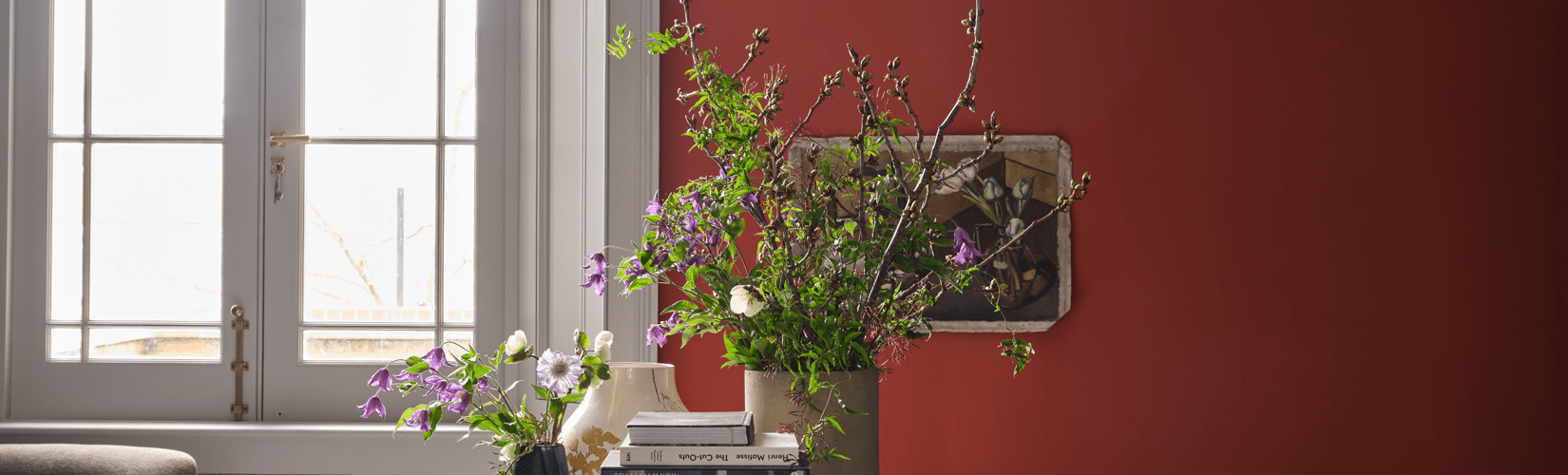
Berry Red
A shade rooted in nature, Viva Magento has been announced as Pantone's colour of the year, making it one of the top colour trends for 2023. Descending from the red family, it is a colour that promotes a joyous and optimistic celebration and is inspired by the red of cochineal, one of the most precious dyes belonging to the natural dye family.
Berry red shades like Viva Magenta are powerful and empowering, revelling in pure joy and self-expression. It is a colour that is full of wit and inclusive of all, and is the perfect antidote to the subdued and muted tones we have seen over the past few years.
We've put together a selection of our favourite red, burgundy and magenta tones for those seeking to infuse the colour into their homes. For the brave, we have bold red paint shades from Farrow & Ball or if you're just dipping your toes in, a few subtle ornaments and accessories will incorporate the trend gently into your home.
 |  |  |  |
Forest Green

The new, go-to colour, green has seen a surge in popularity over recent years. Reflecting nature and serenity, popular tones range from the light and airy feel of Farrow and Ball's latest shade, Eddy to the vibrant and verdant tones of Whirlybird. A room painted in green helps to bring the outdoors in. While accessories and room accents such as dining chairs and sofas gently nod to the trend. Saturated tones such as, Beverly lean beautifully into the colour-blocking trend (taking inspiration from the fashion world) and paired with complimentary accent colours, such as Selvedge, make a joyful statement.
 |  |  |  |
Dusky Pink

Warm, dusky pinks are having a moment and are becoming considered a 'neutral' in the interior world. And for good reason, they provide a sophisticated backdrop to popular materials such as brass and gold, and with bluey-grey undertones they avoid the sweetness associated with pastel colours, making them ideal for every room in the house. More recently, we have seen pink move away from bedrooms to living rooms, bathrooms and kitchens as the shade pairs beautifully with modern cabinetry in complimentary dark colours, such as inky blue and charcoal.
Farrow and Ball's Templeton Pink is tipped to be the new Setting Plaster and we can see why. It creates a warm, welcoming space and looks particularly inviting in low light. We can see this colour becoming a popular go-to for years to come.
 |  |  |  |
Warm Neutral

Whilst we are seeing the resurgence of rich and bold colour trends, there is still space for the calming effect of warm neutrals in our home. Neutrals are drifting away from grey shades to a warmer palette with golden undertones that reflect the natural world. Think wheat fields, barley and oatmeal - like Farrow and Ball's new Stirabout, a colour inspired by Irish porridge. Neutral tones embody a sense of calm and tranquillity and satisfy our need for harmony. They provide a comforting backdrop when paired with natural materials such as leather and wood, but also work beautifully with rich, bold colours in an accent chair, painted furniture or a vibrant sofa.
 |  |  |  |
Ink Blue

Blue has been a design favourite for many years and its popularity looks set to stay. Shades are becoming deeper, darker and more sophisticated as we lean in to its cocooning effect. Ink blue nods to the classic heritage style that has made a resurgence, and is becoming an increasingly popular choice for cabinetry and wood panelling in hallways and boot rooms as well as communal areas such as kitchens and living rooms.
Like dusky pink, ink blue makes a wonderful backdrop to brass and gold materials giving interiors a modern update. For a more traditional vibe, pair with polished nickel or chrome for a classic heritage feel.
 |  |  |  |
Whatever your individual style, we're sure that one of these colour trends will work beautifully in your home, whether you're planning a full redecorating project or just looking to incorporate a few on-trend pieces into your decor.