From wondrous rouges and romantic greens to fresh new takes on neutrals, Farrow and Ball’s new paint colours are out and they’re as vibrant, daring and delightful as ever! Their 2018 colours see a broadened palette that remains suitable for interiors and exteriors both old and new. Read on for a first look at F&B’s eagerly awaited new paint shades...
Discover Farrow & Ball's New Paint Colours For 2018

No.291 School House White
Light, soft and timeless, Farrow and Ball School House White offers a breath of fresh air to the everyday interior. A go-to tone, white always looks spectacular, its pared back, tranquil beauty providing a blank canvas on which to accentuate your home decor. Reminiscent of the colour used in old school houses, this new F&B shade comes without the cool undertones of other white paints in the collection, perfectly complemented by No. 239 Wimborne White in neutral schemes.

Shop School House White

No.292 Treron
Farrow and Ball's Treron is a brilliant paint for devotees of No. 25 Pigeon, this shade is a dark green version of this classic colour and is aptly named after the green sister bird of the same species. Farrow and Ball Treron is fresh and traditional in feel, its undertones at home with interiors where lots of natural and organic materials are used. This warm tone consists of olive and grey pigments, creating a homely, country aura when used alongside No. 3 Off-White.

Shop Treron

No.293 Jitney
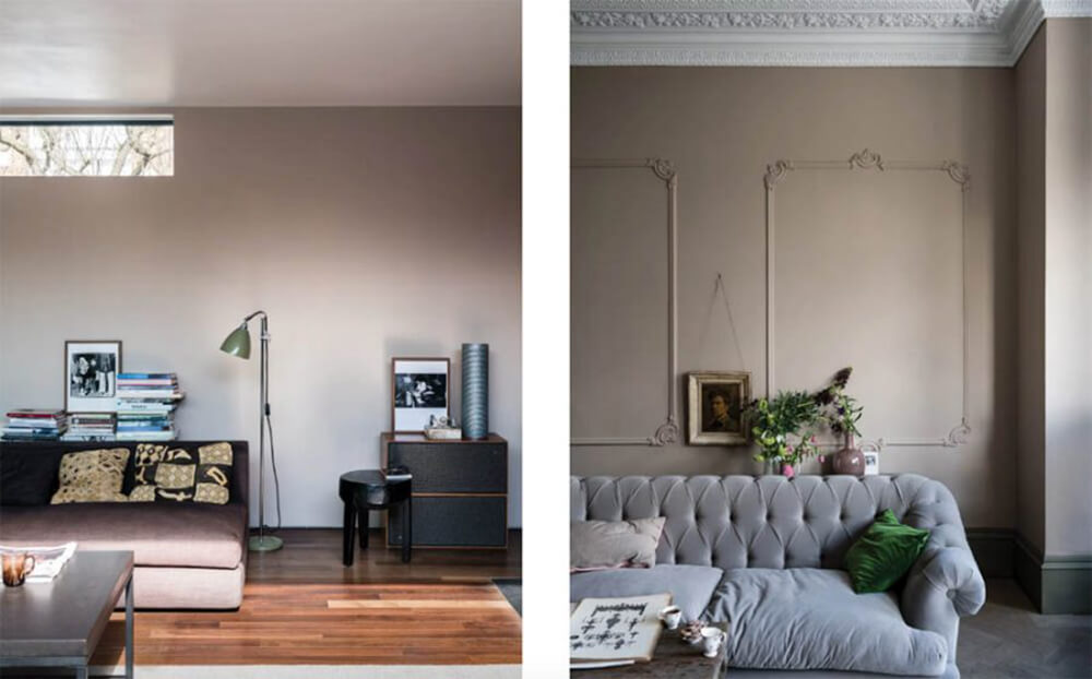
Neutral reimagined, Farrow and Ball Jitney is muted, earthy and relaxed, sitting somewhere in-between the greyer No. 229 Elephant’s Breath and lighter No. 264 Oxford Stone. This brown tone offers a slightly darker alternative to ever-popular magnolia tones, especially when complemented with No. 2008 Dimity.
Shop Jitney

No.294 Paean Black
Farrow and Ball Paean Black serves to complement any home, its effect rich and intimate in the bohemian interior yet neat and distinguished on traditional exteriors. This red-based black is handsomely chic, inspired by the leather shades of old hymnbooks and suitably named after the term for a song of praise, triumph and thanksgiving. Complement alongside the creamy tones of No. 226 Joa’s White to bring this red based hue to life.

Shop Paean Black

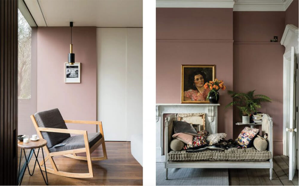
No.295 Sulking Room Pink
Inspired by the evocative tones of traditional boudoirs, Farrow and Ball Sulking Room Pink takes its name from the French ‘bouder’ – to sulk. This light, powdery rose tone will work in harmony with a wide range of whites, particularly the bright No. 2006 Great White, it’s incredibly soft nature creating a romantic and luxurious feel in interiors both traditional and modern.
Shop Sulking Room Pink
No.296 Rangwali
Exotic, vibrant and adventurous are just three words you could you use to describe this brand-new paint colour. Farrow and Ball Rangwali derives its name from the powder thrown enthusiastically amongst crowds during the Hindu Holi festival of colour that takes place in India each spring. Its absorbing depth is achieved by the addition of a small amount of black pigment to the rich pink blend, creating a deep, bright and vivid appearance that contrasts beautifully against No. 2005 All White.

Shop Rangwali

No.297 Preference Red
Perhaps F&B’s most daring shade in their new colour collection, Preference Red's deep, rich colour is reminiscent of the spectacular rouges of 17th and 18th century Baroque architecture, renowned for its marvellous grandeur and depth of hue. A complementary contrast with No. 15 Bone, Farrow and Ball Preference Red is named in honour of F&B’s original trade name, Preference Paints.

Shop Preference Red

No.298 Bancha
A Japanese green tea leaf, Farrow and Ball Bancha creates an aura of security and serenity when used on interior walls. Rich in pigment, this shade is perfect for those who wish to embrace a stronger colour in the home and looks particularly striking when used alongside neutral No. 201 Shaded White. A slightly darker version of F&B’s much-loved archive colour, Olive, this fashionable green is a sure-fire mid-century statement for the modern home.

Shop Bancha

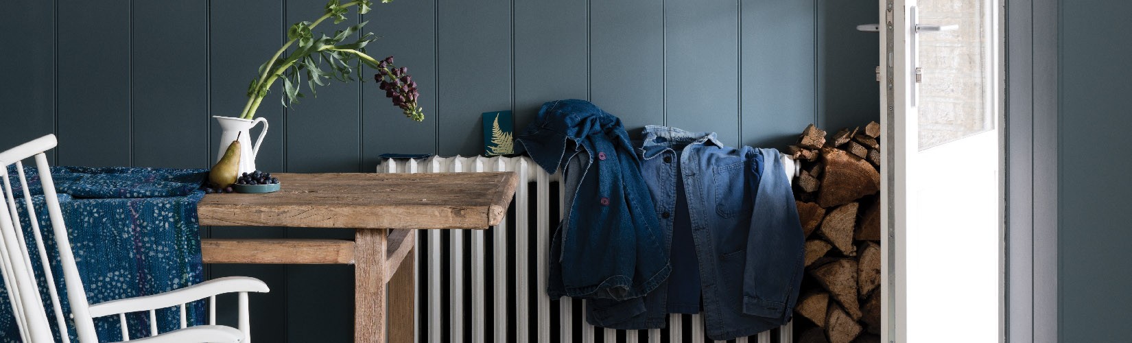
No.299 De Nimes
Last but certainly not least is Farrow and Ball De Nimes. Taking its name from the cloth of everyday workwear made in the city of Nîmes in Southern France, this solid blue tone is elegant and grounded. It’s warmth contrasts beautifully with the cream, sandy tone of No. 201 Shaded White, whilst its fresh hue hints at cadet blue notes that are ultimately fashionable and popular.
